Behind the Scenes with Bon Bons to Yoga Pants by Katie Cross
 Sometimes it’s the smallest details that take an e-book from just ordinary to something special. Let’s walk through the production process with a recent project: Bon Bons to Yoga Pants is the fifth book I’ve produced for indie author Katie Cross, but it’s the first one in a new genre and new series for her.
When a new project is on the virtual table, the first thing we have to establish is the stylesheet. How big should your chapter headings be in relation to the body text? Will the fine print on your copyright page be centered or left-aligned? In this case, we had an existing stylesheet from Katie’s Network Series books, but those are YA Fantasy while the new series is Contemporary ChickLit, so I started with the Network Series stylesheet as a base and then modified it.
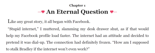
 Then, there’s the question of art assets and graphic elements, if any. Many e-books don’t use any images other than the cover itself, and choose typographic symbols to embellish titles and create scene breaks. However, when you have lovely pieces of vector art available from your print book, you may want to use them in your e-book as well (there are pros and cons to doing this, and it’s part of the conversation we have with any new client). For Bon Bons to Yoga Pants, Katie’s fabulous cover designer—Jenny Zemanek with Seedlings Online—also created an adorable heart-and-swirls divider for scene breaks and a fun title banner with dots and hearts. The chapter titles and the dedication and read-more pages needed a little something, so I clipped some dots and hearts from the title banner to come up with additional embellishment pieces that matched the book’s design concept.
 Once we’ve got the stylesheet and graphic design elements hammered out, it’s time for the finicky and time-consuming process of creating the e-book shell, importing the manuscript chapters into it, building the integrated table of contents, and applying any necessary font formatting. I go through every line by hand, cleaning up invisible bits of code and checking to make sure everything works and looks nice. I always appreciate clients like Katie who bring me professionally edited and proofread manuscripts, and so although I’m not hired as a proofreader, if the manuscript is already pretty clean I will flag anything I do happen to spot (it’s not my place to judge, but I can’t do this if the manuscript is a hot mess). Katie’s excellent print typesetter, Chris Bell with Atthis Arts, also catches things, so at some point in the process we end up exchanging lists of corrections. One of the reasons I love doing e-book production for Katie is the team of professionals she has surrounded herself with; at one point, I’d flagged “weigh in” as possibly needing a hyphen, and after a quick consultation with editor Catherine Payne of Quill Pen Editorial, Katie was able to get back to me and confirm that we were going with “weigh-in” anywhere it served as a noun rather than a verb. Clear, speedy communication keeps the whole team happy and the project flowing smoothly.
After the manuscript content of the book is complete, the project is close to being wrapped up, but we still need to finish up the front matter and back matter. Since I’d already worked with Katie on four other books prior to Bon Bons to Yoga Pants, I had her “about the author” content on file and a pretty good idea of what else she’d want, but since it’s the first book in a new series and a different genre for her, we still needed to chat about the positioning and content of a few elements (e.g., “Other Books” in her Network Series is at the beginning, but “Read More” in the new series is at the end and laid out in a different way).
When the book itself is all done and looks perfect to the reader’s eye, there are still some invisible tweaks needed. Semantics tell the e-reading device where the reader should begin the book, among other things; Katie decided that she wanted Bon Bons to Yoga Pants to open at the Author’s Note up front, rather than the first page of the story. Metadata is embedded information, such as the “description” element (the e-book equivalent of a back cover blurb). These details go unseen and are not at all sexy, but when the book opens automatically to the right place, and appears in the reader’s e-book library with the correct information filled in, that’s a good thing.
The last step is to create different editions depending on the author’s needs. For Bon Bons to Yoga Pants, it was just the usual: a mobi format for Kindle and a Smashwords edition to comply with their licensing requirement, since it was being rushed straight to publication at the request of Katie’s Wattpad fans. But we can do any number of editions, if desired—an Advance Reader Copy? A launch team edition with a special note from the author included? All you have to do is ask.

Curious about this book?
Bon Bons to Yoga Pants is available wherever e-books are sold.
Got a manuscript of your own to publish?
Contact us and let’s get started…
Please note that all decorative elements on this page are from the book and are used with permission.
Many thanks to Katie Cross for allowing me to share the production process for her book.

Note to self: Create a style sheet. I’m always left wondering… uhm how big was my font from the last book???
Haha! Great post!!! I have a limited budget, so I have to do most formatting myself, but I always use Katie’s books as a goal because they look sooo awesome.
LikeLiked by 2 people
Thanks, Constance! Bet you’re doing a great job of your formatting. If you need any help with your stylesheet, just ask…
LikeLiked by 1 person
Reblogged this on Live Your Dreams.
LikeLiked by 1 person